


the bears on hemlock mountain
honoring a favorite book with (you guessed it!) another book


When I was a kid my family used to go camping every summer in upstate New York, and there was a shop in Lake Placid I loved visiting called With Pipe & Book (as the name suggests, it was both a secondhand bookstore and tobacco shop). Over the years I got a couple of special old books there, including this one: The Bears on Hemlock Mountain, written by Alice Dalgliesh and illustrated by Helen Sewell.
The brief plot: a young boy is sent over a hill to fetch an iron pot from his aunt, he ends up goofing off (eating cookies and taking a nap) when he gets there, then has to walk the pot back over the hill in the dark. As he’s going up and down the mountain, he’s worried about bears, so he says this rhyme in time to his footsteps:
THERE ARE NO BEARS ON HEMLOCK MOUNTAIN, NO BEARS AT ALL. OF COURSE THERE ARE NO BEARS ON HEMLOCK MOUNTAIN, NO BEARS, NO BEARS, NO BEARS, NO BEARS AT ALL.But of course there are bears, so he flips the pot upside down to hide from them until his family, worried that he’s been gone for so long, finally finds him.
The reason this book has been on my mind lately is because I didn’t have a car for my last months at Penland, so I was walking everywhere, and every night when I walked over the knoll to get home I thought of that rhyme. I never ended up seeing any bears, but I did decide to make my own version of the book.
I did all of the planning and printing at Penland, and then folded and assembled all the pages after I moved. I don’t like moving (or any disruption to my beloved routines) so I thought having a project to immediately pick up at home would be good for me.
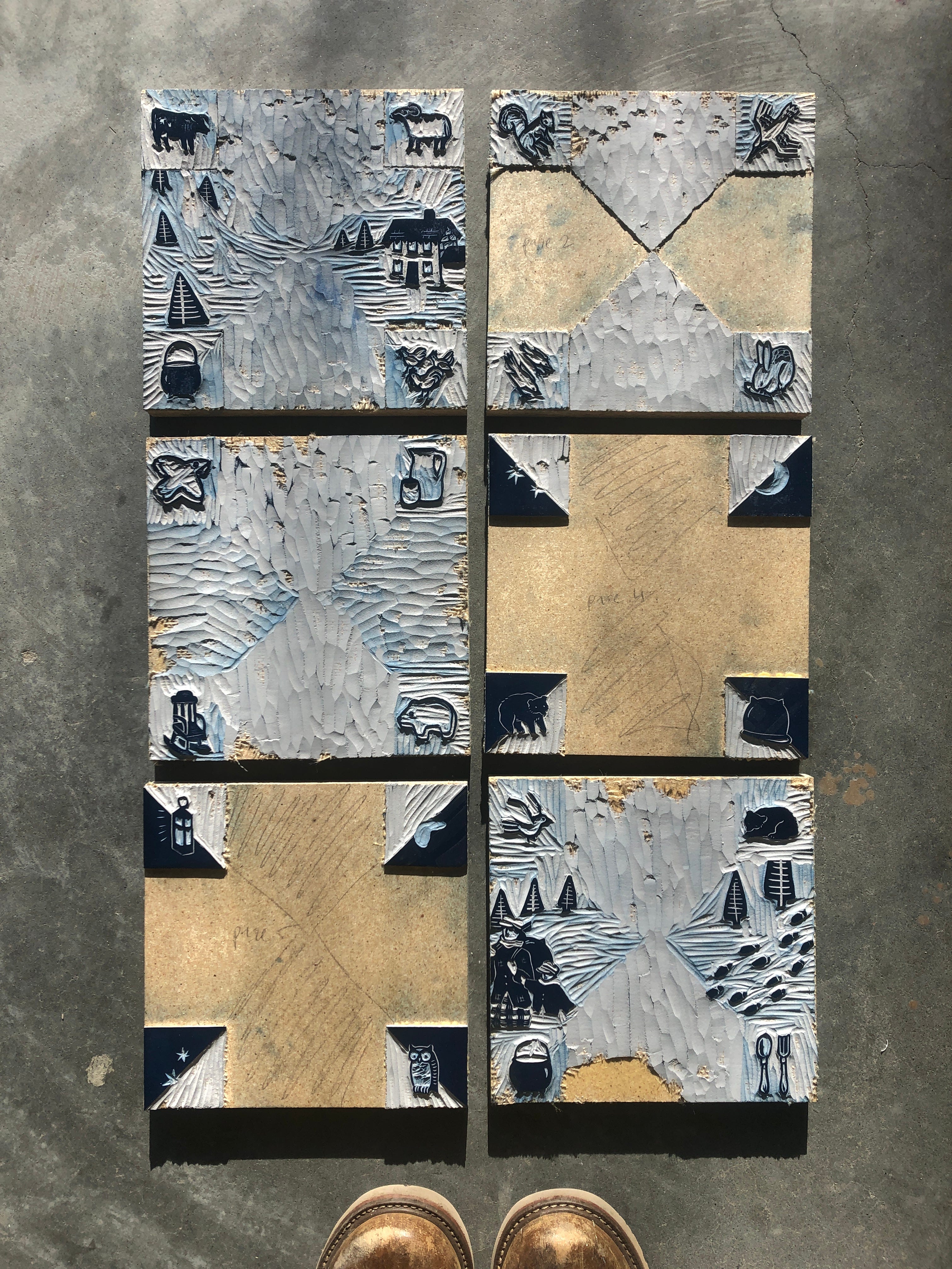
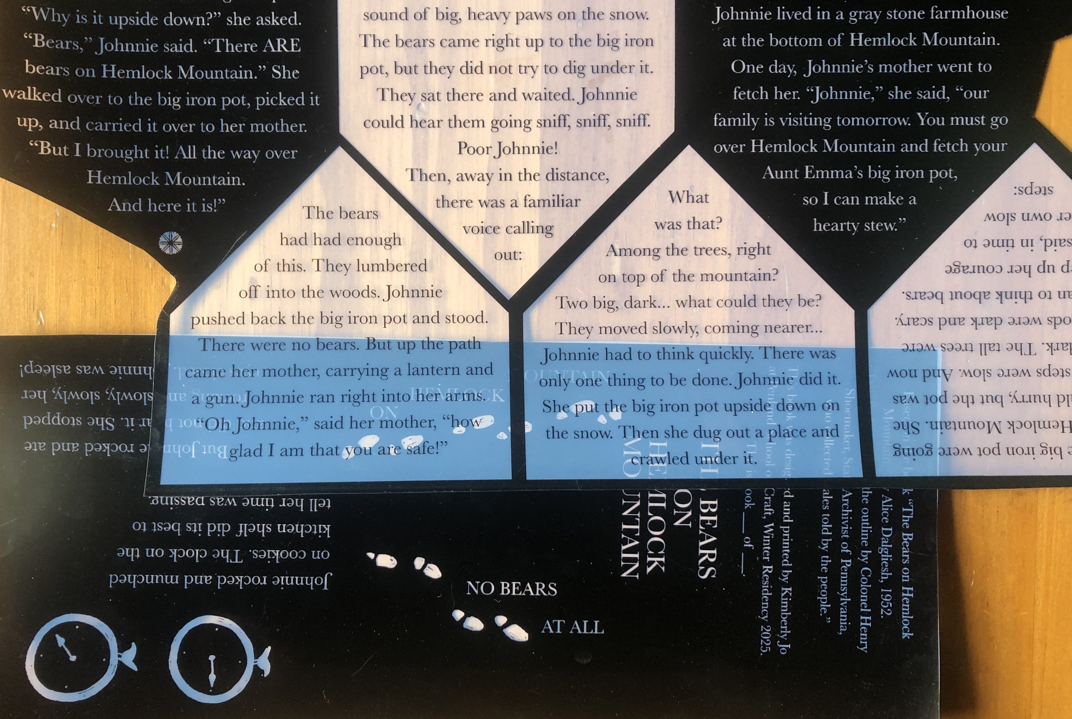
The imagery was printed with a two-layer reduction, drawing from the illustrations in the book. My natural style is quite detailed and intricate, so trying to emulate Sewell’s more simple, graphic imagery was a really gratifying experiment. The text layer was printed using photopolymer plates, which meant I did not have to set all of that type by hand. Here’s two scans of finished pages before they got folded up:


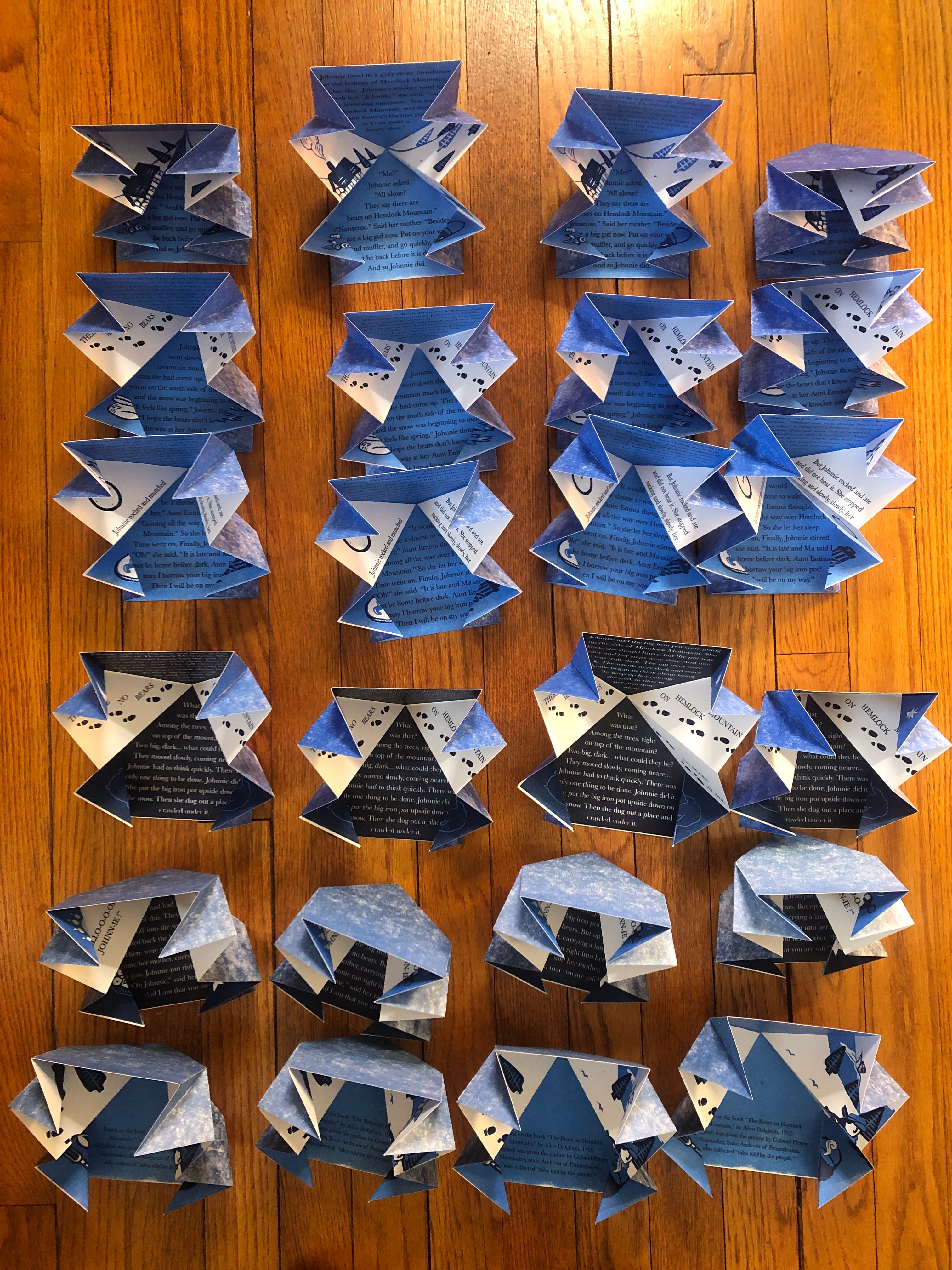
The book in its final form is made up of six 8.5 x 8.5” pages, folded with the Turkish map fold - which I chose because it looks like a mountain when the book is both closed and open.


I printed two editions with my leftover paper, which came in two weights. For the edition on heavier paper, I printed the other side of the pages with a flat so that when the book was open, the backside would be blue. For the lighter paper, I couldn’t do that because you’d be able to see the ink through the other side, but I wanted the front and back covers to be blue, so I spent over an hour tweaking registration to get one blue polygon printed on the opposite side of the front and last pages. It was such a pain, but very much worth it for how the final book came out!
I am so pleased with these, this was my first time creating an edition of books and it was so satisfying to see it all come together. It got me thinking about how form and structure can enhance content, and how to arrange images and text to direct how the reader will follow the narrative.
And finally, here is a flip through of the book:
Thanks for reading! I’ll see you in the next one~
This is an incredible project. The film of the book being opened is a piece in itself—the author and illustrator of the original must be grinning from ear to ear to see this story’s long ripple across time. The shape, story and text lean on each other beautifully. Brilliant. Congratulations.